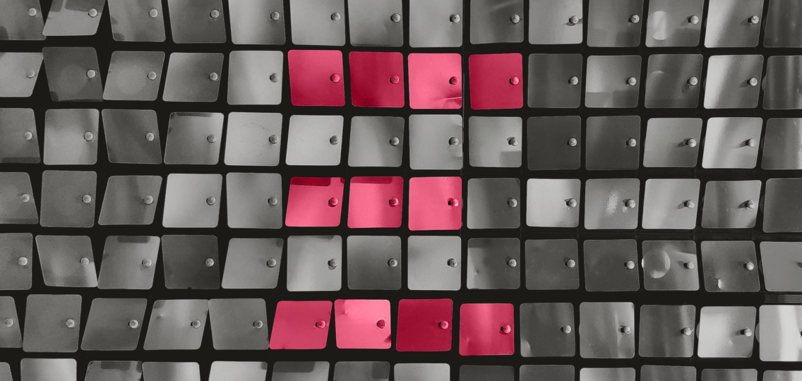
Pantone’s 2023 colour of the year is Viva Magenta – very close to our own Eximia Pink!
“A brand using Viva Magenta expresses that it’s fearless, engaging, and looks at the world unconventionally to bring about new solutions.” Don’t take it from us, those are the words of colour experts Pantone!
Many of the words associated with this year’s colour are exactly how we describe Eximia, and we’re proud that we align with Pantone’s description of brands who are using it.
But before we get to Eximians’ take on this exciting news, here’s how colour impacts communication – and how you can harness its power when talking to your people about your total reward offering.
The power of colour
Colour is probably the most important tool in visual communication. It can provide directions (as in traffic lights) or influence our emotions. For example: blue is trustworthy and dependable, so many banks choose it for their logo; but red is stimulating and increases your appetite, so it’s the colour of choice for many fast-food outlets.
As designers, we need our work to make the right impression, so that audience instantly engages with it. This process is called colour theory, and we use it every day to help us craft our client designs. Choosing the wrong colour can instantly change a mood. For example, if you’re talking about sustainability, soft earthy greens convey nature and mother earth. Using a neon green is more likely to conjure images of toxic chemicals.
When we create communication materials for our clients’, we take a step back and think about how they want their employees to feel about their reward or share plan. Ultimately, humans are emotional creatures. For them to engage with the message and respond to it, they need to have a connection. Colour can help create that.
Choosing the right colour is a top priority for Eximia’s designers. Colours are powerful, so we give them the time and respect they need. Just as Pantone does.
Viva Magenta and Pantone
Pantone puts a lot of thought in identify their colour of the year. But all their annual choices align with what’s happening in the world at that time. This year’s Viva Magenta, which comes from the cochineal beetle, acknowledges our pull towards natural colours as movements swell around climate change, sustainability, and land protection.
Not only that, Pantone says, Viva Magenta provides “assurance and motivation” – much needed after a pandemic, war, an unstable economy, social unrest, supply chain breakdowns, and increasing concerns around climate change. Pantone explains that “Viva Magenta cloaks us in both power and grace, and sends us out into the world with the verve we’ve yearned for”.
A powerful colour indeed.
Viva Magenta! Viva Eximia!
When Chrissie founded Eximia, she knew that she wanted a brand that oozed sophistication and stood out from the crowd. She chose our main brand colour to help achieve this. We aren’t a typical employee communications consultancy – we simplify the complex because our team are a blend of creative and technical topic experts.
We’re unique, and our pink reflects that.
Here’s the team’s reaction to the connection between Pantone’s colour of the year and our brand:
Fearless
Founder and MD Chrissie says “I love that our brand signifies that we’re ‘fearless’ – to offer a similar service to others but deliver it in a unique way requires conviction and fearlessness. We’re constantly navigating our way through change and uncertainty – but as a team, we see this as an opportunity to improve, innovate and challenge the process in the world of total reward communications. It’s great to test and try new things!”
Bold
Carl, our Design Lead, says that for him ‘bold’ is the word that connects Viva Magenta and Eximia. He explains “‘bold’ is one of our values —we think big and challenge the process. Today’s visual trends lean towards neutrals, but that’s not us. We want our brand to grab attention. We see the world differently and find exciting new ways to communicate Total Reward topics; our brand reflects that.
Warmth
Our animator Andrew says that he thinks of the word ‘warmth’ to describe Viva Magenta and Eximia. He says, “Viva Magenta is a colour that’s rebellious, but not without softness. As a brand, we show up with humanity. We work with clients who want to improve their employees’ financial futures and in uncertain times, how we communicate that requires a degree of empathy – and warmth.”
Colour has a profound effect on us, even when we don’t know it.
If you want to work with a Total Reward communications agency that stands out in a sea of grey and is making waves in corporate communications, then drop us a line.